
Pictures of Start Button Cap (for your head)


Thread Starter
Former Sponsor
Joined: Oct 2000
Posts: 7,049
Likes: 1
From: Timonium
Here are the pictures of the Start Button cap (see http://www.s2000online.com/forums/showthre...p?threadid=4425 if you're serious about wanting to buy one from Mark Bombardo.
The cap has the Start Button embroidered on the front.

The embroidery is first rate.

S2000 or VIN number embroidered on back, above buckled adjustment strap.

I kept mine stashed away, and would not wear it until my VIN came. I wear it all the time now .
.
It's a very high quality hat.
The cap has the Start Button embroidered on the front.
The embroidery is first rate.
S2000 or VIN number embroidered on back, above buckled adjustment strap.
I kept mine stashed away, and would not wear it until my VIN came. I wear it all the time now
.It's a very high quality hat.


Registered User

Joined: Oct 2000
Posts: 721
Likes: 0
From: -
A few comments from a graphic perspective.
I find the white (silver?) border to be a bit too wide and the lettering too close vertically.
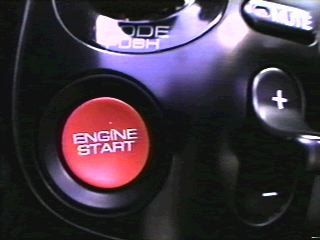
Referencing this image of the start button you'll notice that the actual lettering is very close together. However embroidery is not as clear as printing. The embroidered lettering this close is difficult to read.
It would be nice if we could have "the" logo on the back. If we could not have "the" logo, I'd actually prefer nothing to be there.
I agree with George, I'd prefer a different style. Mabye not denim but something other than black. Maybe a light pastel or light grey. I would also suggest using a non-reinforced cap. This one appears to have the internal reinforcement material sewn inside. With a lighter color hat a black border around the red button would look quite good. Making the button larger on the front of the hat might look good as well.
Some embrodieriers I know could also use different shades thread to highlight the button. This would suggest the concave surface of the button and the glossy appearance.
I can prepare some comps if you'd like.
[This message has been edited by Mikey (edited November 01, 2000).]
[This message has been edited by Mikey (edited November 03, 2000).]
I find the white (silver?) border to be a bit too wide and the lettering too close vertically.
Referencing this image of the start button you'll notice that the actual lettering is very close together. However embroidery is not as clear as printing. The embroidered lettering this close is difficult to read.
It would be nice if we could have "the" logo on the back. If we could not have "the" logo, I'd actually prefer nothing to be there.
I agree with George, I'd prefer a different style. Mabye not denim but something other than black. Maybe a light pastel or light grey. I would also suggest using a non-reinforced cap. This one appears to have the internal reinforcement material sewn inside. With a lighter color hat a black border around the red button would look quite good. Making the button larger on the front of the hat might look good as well.
Some embrodieriers I know could also use different shades thread to highlight the button. This would suggest the concave surface of the button and the glossy appearance.
I can prepare some comps if you'd like.
[This message has been edited by Mikey (edited November 01, 2000).]
[This message has been edited by Mikey (edited November 03, 2000).]
Thread Starter
Former Sponsor
Joined: Oct 2000
Posts: 7,049
Likes: 1
From: Timonium
I appreciate the comments, but this is not my project. I was just trying to assess interest for the guy who had them made before and I do not plan to get into the hat business myself.
It may all be a moot point anyway: so far, there aren't enough people interested to make it worth a go.
It may all be a moot point anyway: so far, there aren't enough people interested to make it worth a go.


Thread
Thread Starter
Forum
Replies
Last Post